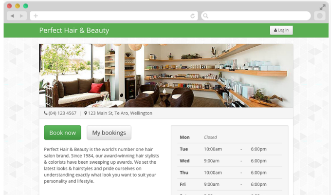
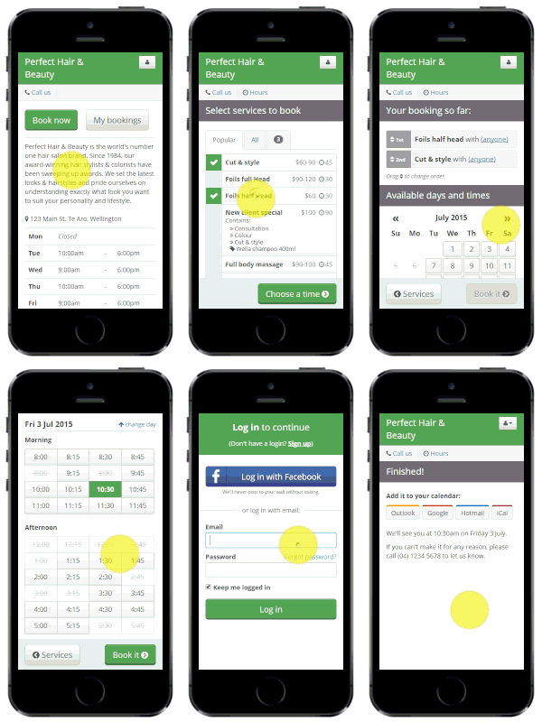
The Online Booking website has been rebuilt from the ground up to make it easier to use on all devices, faster and deliver you more bookings. And now it’s live to your clients!
Why we’ve made the change:
- From our data, mobile users make up 40% of total visitors to Online Bookings.
- Almost half of our customers actively use Online Booking, and we want it to be the best it can be!
- It’s one of our most requested features and now’s the perfect time to make a change. We thought it’s a great idea too!
- It’s going to look great on all screen sizes (a.k.a mobile responsive)
- See this blog post for more info.
What do you need to know/do?
The new Online Booking page is easier than ever to make it look the way you want.
There’s a few things that you should do:
- Set the info you show:
- Show or hide your prices – currently they are set to show
- Show or hide your service times (mins) – currently they are set to show
- Online Booking website settings:
- Add/update your opening hours
- Ensure your address is correct
- Update the promotional ‘blurb’ about your business
- Set your page background, banner image and colour scheme.
- Tell your clients
- We’ve prepared a set of Facebook posts, email templates and Twitter posts you can use to tell your clients about how your new Online Booking website works. Please share these with your clients!
Log in to Kitomba 1 and make these changes now – they’re easy! If you get stuck, check out our support page where you’ll find some useful how to guides.
At Kitomba, we always love your feedback on how we can make your life easier. If there’s something you’d like to see in Online Booking, go to our feature requests page in the Community and let us know about it.


