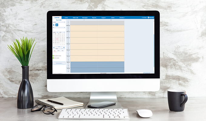
We’re excited to release the new look Kitomba! Remember it will take a few weeks to roll this out to all of our customers, so keep an eye on your emails, texts and in Kitomba as we’ll give you a heads up just before you receive it.
Kitomba’s new look
To refresh Kitomba and give it a new look, we set out to make it cleaner, simpler and more consistent with Kitomba 1.
We achieved this with some simple design changes, new colours and icons. We also chose to keep everything in its usual place and features working as they always have, so you end up with a better looking Kitomba that doesn’t require you to re-learn how to use it.
Kitomba’s before and after
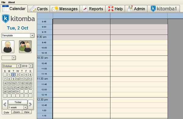
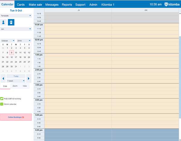
We’re sure you’re used to before and after transformations, so we’ve taken the time to do our very own! Check it out:
Navigation
Before
After
![]()
Appointment Book
Before
After
Colours
Before
After
Icons
Before
After
What’s next for Kitomba?
Our team will continue to make changes to Kitomba and Kitomba 1 to make them more intuitive and easier to use, while focusing on developing new features to provide more value to your business.


As long as it doesn’t get complicated with the new changes.
I already stuff up with how it is now and clients get upset .
Hello Kitomba,
Everything in the new version is too indistinct and toooo small.
Much preferred the ‘now’ version.
Can see me squinting at the screen.
Lack of boxes round the calendar makes it less defined,
the small tabs at the top!!!!!
Sorry not a good change – I’ll be hunting for my glasses every time I go to computer.
Kind regards Brenda Allinson
Hillcrest Hair Design / Dezigner Hair
Not loving the new look!! Can’t see the icons easy. There was nothing wrong with the old way
Hi , looks good . Is this something extra to pay to have this new look or is it just an update ? Sorry if this seems like a really dumb quest, cheers anita
Much clearer very nice thanks
Not a happy bunny with the updated look, bland, too pastel toned, marks out of 10 – 2 with a following wind
Tony
This is great! We are so lucky to have a company that moves forward with the times and is always trying to improve and make things function. Well done K
New look looking fantastic! Can’t wait for more features! A waiting list and Kitomba will be perfect!
Yes I second a waiting list ! That would be brilliant
Thank you
Looks great
can we opt out of the update???
Can you please make the cautions (yellow triangle) more noticeable? Having cautions on files is really important and in a fast paced beauty environment they are getting missed. Please make the text notes on appt’s dark. The writing is faded and hard to read. Can you please make the tick large again when someone has confirmed? Could you also make the ‘arrived’ symbol and the ‘started appt’ flag different colours? It used to be so easy to see what was happening within the salon at a quick glance. Now it’s very hard.
Hi,
I totally agree with Keelys comments above. Everything she has mentioned is getting missed in the Beauty world with our little 15/30minute appointments. Cautions and notes especially get missed which are vital to a clients treatment/experience. In the system I have just migrated from there was a ‘note” book that popped up that we could write notes in that attached to that appointment and then the employee could see there was notes attached to that clients app.
Hi Keely, if you tick the box “Colour Based Appt Status” under Preferences > Calendar, it makes it nice & easy to see appointment status at a glance
Just finding the colours too pale and makes it hard to see things quickily.
Hello,
I love this system although there are 2 things it’s missing that would greatly help me. A deposit option that shows an icon on the appointment when the client has paid a deposit and then this should come up when processing the sale.
The other thing is a summary page the has all the notes on one page and all recent sales on one page. This page should not be able to be edited once saved.
Thank you!
Bree
Would be great to also have the red timeline ticker like K1, since we’re aiming for the same look!

Makes keeping track of where you’re at on the calendar so much easier